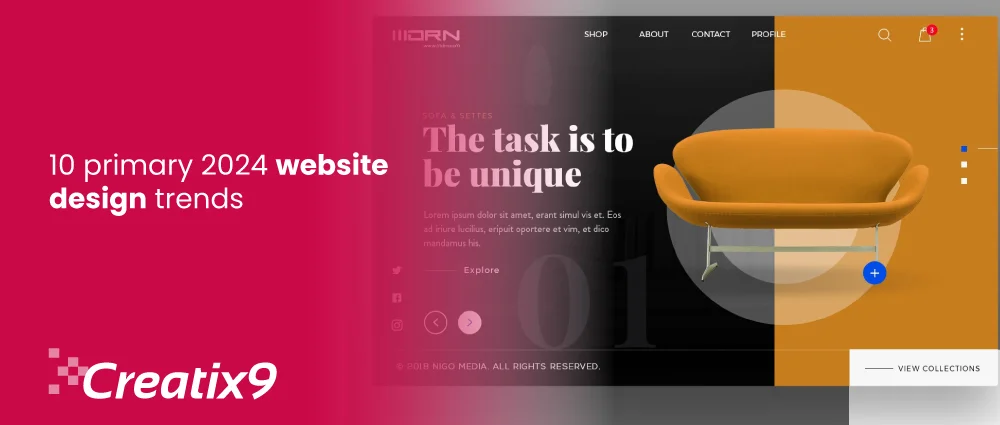
For the past few years, bold interaction, animations, geometrics, and 3D ideas have influenced many visitors.
Now, most businesses are applying different color mixtures, intricate visuals, and vibrancy to their website designs, which makes them more appealing to the audience. Such ideas are rocking the design setup towards lively designs.
When stepping into 2024 in its first quarter, expectations are to give dynamic movement in web design.
This year’s aim for businesses is to create designs that create a mesmerizing user experience (UX) when guests, come and scroll or click on their website.
So, up-to-date with the new design trends to generate high web traffic and conversions.
Applying these trends to your website design or building isn’t easy. Approaching a trustworthy website design company guarantees the correct use of innovative design techniques that propel success in the digital space.
2024 website design trends
Let start what we have compiled this years regarding website design trends.
1. Animation stimulation
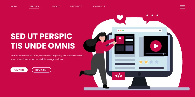
The web is now all about movement and animation. Animated website design allows brands to show their dynamic personalities, colors, and typefaces.
Using “Drunk Elephant,” a skincare business, as an example, their website takes you on a journey. A fresh animation appears every time you scroll, enticing users to stay on the page and browse their merchandise.
By decreasing bounce rates and lengthening visitors’ stays on the page, these interactive websites give your website more authority in the eyes of search engines. Additionally, micro animations are emerging as a distinctive and understated method of interactive website design.
Another illustration is the website for Meplace, a nursery that incorporates several of the following website design trends for 2024. It is a modern design with moving typography that scrolls with the elements, tiny animations on geometric shapes, and scrapbook-style pictures display its offerings.
But watch out for loading times! As you add animations, be cautious and maintain a short loading time.
Call Creatix9 US, the certified website design company, to create a website with animation simulation. Schedule a free session with us.
2. Kinetic Typography
The use of animated opening titles in feature films in the 1960s gave rise to the animation technique known as “kinetic typography,” or moving text. This technique can also be used in website design to catch visitors’ attention immediately when they land on the homepage.
Gravity Global, an award-winning marketing agency, uses dynamic typography to draw attention to critical areas, direct users through the scroll, and progressively expose content.
What I like: Kinetic typography can excite readers and facilitate their text digestion. It’s also captivating and visually appealing.
3. Cinematic scrolling
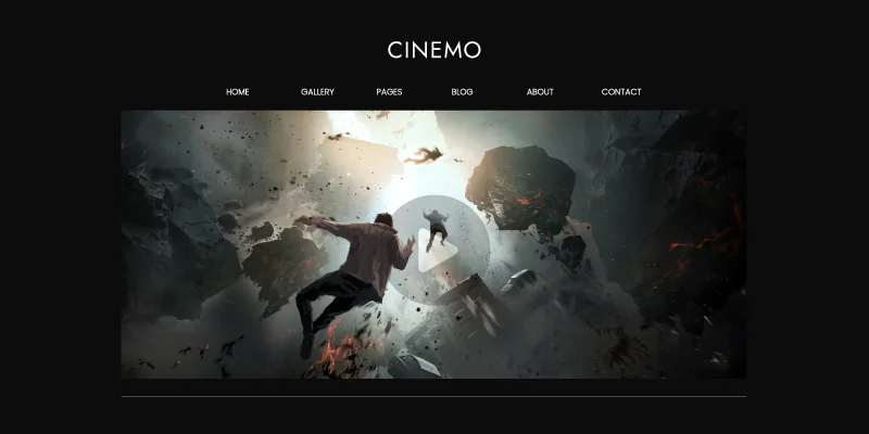
Scroll effects are nothing new but constantly change, such as browser capabilities and content consumption patterns. Cinematic scroll, or inspired visual scrolly-telling, is the latest in the scroll effects space. It’s a fantastic method for telling a narrative that builds your brand and keeps your visitors amazed.
This movement uses standard cinematographic methods like lengthy tracking shots, slow zooms, 3D rotations, and full-screen visuals. Even while these fantastical scenes are incredibly absorbing, they also accept the manufactured quality of the internet. Like a movie theater, the website gives the impression that a visionary has meticulously created it.
This trend demands a larger budget, and 3D product animations are its primary use. This approach is helpful for companies whose products are high-tech or unique since it adds drama to the product and makes us curious about what will happen next, much like a mysterious movie teaser.
If you really want to build or redesign your site with cinematic scrolling and kinetic typography, contact the web design company Creatix9 US.
4. Geometric aesthetic
You can convey the meaning through geometric shapes. Intentionally utilizing forms in website design can evoke feelings and sway visitors. Designers are using shapes to frame headlines, photos, products, and calls to action (CTAs) to make these elements louder and more visually attractive.
Proxies utilize softly rounded squares and ovals to create a cohesive and organized look.
5. Footers feature
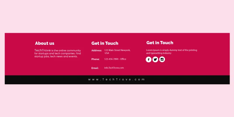
When it comes to website design trends, designers usually focus on the most visually striking site elements, such as the header, the product display, or the call to action (CTA). In 2024, however, designers are shining a spotlight on the footer—an often overlooked, unsung member of the website.
Unconsciously, most of us have witnessed hundreds of footers. With a neutral backdrop color and tidy columns of little text, the design is strictly functional. They mostly carry practical information, such as legal disclaimers and links to pages with lesser priority. Presently, designers are saturating the footer with vibrant colors, motion, and images.
This trend works well for unconventional firms that already approach their website design in a creative, scrapbook style. It acknowledges the use of the area for additional branding elements or for highlighting social media connections, which is fantastic for smaller, more recent companies attempting to make an impression on customers. Overall, this year’s most cheerful website design trend serves as a reminder that even smaller players may and should cause joy.
6. Brutalism
Some designers choose more diverse, convention-defying structures to stand out in a sea of neat, well-organized websites. Many well-known businesses are now using brutalist aspects, even if it can initially look startling.
Often typified by harsh, asymmetrical, nonconformist visuals and a conspicuous lack of hierarchy and order, brutalism developed as a response to the growing standardization of website design.
What users can enjoy is the fundamentals of the user experience—simplicity and functionality—are given top priority in brutalism.
Want to develop a website that shows brutalism and geometric aesthetics with the best footers and headers? Our website development company expertise can do that. Call us now!
7. Pastel palettes
When paired with the melancholy, dark aesthetic popular recently, pastel tones provide a delightful and vibrant contrast. Pastel colors are aesthetically soothing and emotionally uplifting, which is why they have gained immense popularity despite dark mode’s reputation for reducing eye strain.
8. Ultra-Minimalism
Certain designers and companies go above the norms of what should be on a website by showcasing only the essentials, taking the concept of classic minimalism to an extreme. This “ultra-minimalism” trend in website design can greatly benefit the user experience and load speeds.
“We ain’t Plastic’s” website is self-explanatory about what it offers because of its muted color scheme and straightforward design. The iceberg picture also piques people’s curiosity and slows their thinking.
What users like in Ultra-minimalism can enhance website user experience and functionality. We’re shifting it to earlier website design trends because it’s becoming increasingly prevalent on websites worldwide.
9. The retro resurrection
One online design trend for 2024 is drawing inspiration from the past and veering away from more modern minimalism, whether it is the frolicking, unrestrained style of the 1990s or the vibrant madness of the 70s.
Vibrant and striking hues, unconventional presentations, antique typefaces, and graphics are all exhibited. Pursot’s striking homepage serves as one example; the brand’s vibrant name contrasts sharply with a constantly shifting collection of backdrop graphics.
The current and Y2k eras will converge in 2024. Consider it a more tech-savvy version of Y2K. The website for “Experiment Beauty,” a skincare product firm, has an alternative feel with a 2YK style. In the design, you can communicate your brand personality through bouncy typefaces and 3D silver writing.
To properly “break” the design standards, become knowledgeable about certain effective color combinations.
Are you searching for a complete revamp of your site or producing it from scratch? Call Creatix9 US.
Our website design company has a team of experts who can design a site with retro resurrection, ultra-minimalism, and the perfect pastel palette.
Just contact us.
10. 3D design
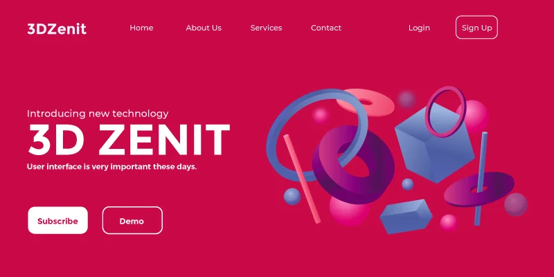
Immersive user experiences are heavily emphasized in website design this year, which explains the increasing popularity of 3D artwork.
Anyone can easily experiment with 3D design using Adobe’s 3D Modeler. Although it requires more skill, Maya is the industry’s most widely used 3D Modeler. Another excellent choice is Blender, a free 3D design program.
Numerous independent 3D modelers can be found on Fiverr and UpWork if you want to add a 3D design to your website but are still determining the task size. Take a look at a few of the Dribbble examples.
This look borrows elements from the cutesy Japanese Kawaii culture, emphasizing pastel colors and childlike items.
Users like this trend because it is cute and whimsical, making it visually appealing and likely to keep visitors on your page longer as they study every feature.
Design Trends You Can apply on Your site
While design fads come and go, building a personal connection with your guests will leave a lasting impact. Ensure the experience you wish to offer that ideal guest aligns with your aesthetic decisions.
Naturally, it’s impossible to create one of the greatest website designs of 2024 by including every trend; in fact, we wonder if it’s even feasible.
However, our website design company experts assure you that you will get the best results if you incorporate most of them into your website design.
Even a few of these website design trends, included as standout elements or minor details, can greatly enhance the user experience (UX) of your website, increasing engagement, CTA clicks, and business outcomes.
Connect with our creative digital agency as soon as possible.

