User experience (UX) and all of your B2B marketing initiatives can be significantly influenced by the look and feel of your B2B website. Understanding what users require in order to navigate your website is crucial. The following 14 b2b web design trends should be implemented right now.
B2B web design, or the process of creating, modifying, and maintaining your website, is essential to B2B marketing. The objective is to give website visitors a favorable brand experience and turn them into leads. In fact, the graphics and style of a website account for 94% of first impressions. In terms of UX and the potential success of your brand, web design is crucial.
Making a website is only one aspect of web design. There are several variables to take into account. A website’s usability is influenced by several different factors, including accessibility, SEO, and visual design. Functionality here refers to both you the business and the end user.
To accomplish this, a web designer needs to keep up with rapidly evolving trends, which might be difficult. But we’re here to assist you, team! See the 14 B2B web design trends to look out for in 2023 below.
Trends in B2B Web Design to Watch In 2023
-
Prioritizing mobile design and responsive design
Did you know that 51% of people today use mobile devices to access the internet? By 2025, that percentage is predicted to reach 72.6% or nearly 75% of the population. Nevertheless, if you don’t think about mobile design first, you could get into difficulties. It’s crucial to incorporate this tactic into the design of your website, product, and other materials.
Thus, let’s discuss mobile-first design. What it is? Starting your design process on the smallest screen feasible, usually, a mobile device is a design philosophy. Content is frequently put first when using mobile-first design. The greatest restrictions apply to mobile, including those related to screen size and bandwidth, and designing within these constraints pushes you to prioritize your content.
-
Scrolling in Parallax
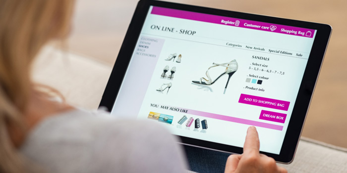
When a user scrolls down a webpage, the background scrolls more slowly than the foreground, giving the impression that the page is deeper. This technique is known as parallax scrolling.
Use it with caution, though. It has its proper time and location. Your website should incorporate parallax scrolling only if it will benefit the user. What knowledge and emotions do you want your users to have after using particular parts of your website? It can be irritating to add parallax scrolling to your entire website without keeping in mind that “users first.”
-
Quick-From Videos
Did you know that a human has a 9-second attention span on average? That is equivalent to a goldfish’s attention span! Because they can keep viewers’ attention, short-form videos are quickly overtaking all other types of material as the most popular. Videos should last 30 to 60 seconds, with the first 30 seconds being crucial for capturing the viewer’s interest. By increasing SEO, brand awareness, and user experience, video integration on your website can significantly increase engagement and prospective leads. It’s a method of visually engaging your users with information.
-
White Room
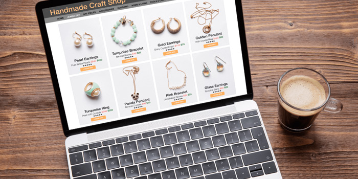
The unmarked space around ecommerce website design components like text and graphics is known as white space. Adding white space to your website improves the organization and flow of the pages.
It aids in readability for users and can be utilized to highlight key details about your brand.
-
Accessibility
It takes more than just following technical specifications to be accessible. The focus is on your users. Your website needs to adhere to WCAG 2.2 or WCAG 3 standards. This means that everyone should be able to access the material on your website, independent of their identity or the device they are using. Content should also be resilient, perceivable, operational, and comprehensible. Included among the accessibility features are, but not limited to:
- Captions and Transcripts
- High contrast colors
- Text to Speech
- Image Alternative text
- Keyboard Accessibility
Making your website accessible increases the value of your content and creates the foundation for an excellent UX. Not sure if your website meets the accessibility standards? You can consult this guide for assistance or utilize the accessible web accessibility tool.
-
Visualization of Data
 The visual presentation of data is known as data visualization. Maps, charts, and tables are included. Remember to pick the type that will enable consumers to understand your data accurately. By 2023, visitors will be able to study and interact with data in ways that will improve their comprehension of the site’s content.
-
AI Integration
Knowing what your users want is essential to B2B web design. AI can help in this situation. These days, chatbots, voice searches, virtual assistants, and many other types of AI help humans and automation work together. By 2025, it is expected that 95% of all customer interactions will be driven by AI. AI implementation benefits both your company and, most crucially, your users. AI improves staff efficiency and lowers human error on the business side. When it comes to users, AI caters to their demands by offering a tailored experience.
-
Minimalism
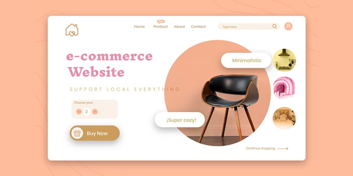
Even with site design, less is more. The functionality of your website is improved by keeping it straightforward and uncluttered. This can involve less graphics, more space between words in the text, fewer animations, and softer color schemes. It facilitates structure for your company, speeds up page loads, and can highlight messaging. It makes your site easier to read and navigate for users, resulting in a better user experience.
-
Miniature Animation
Animations don’t always have to be completely disregarded in order to achieve minimalism. Micro animations are a fantastic choice for giving your b2b and CMS web development depth and interest.
For instance, the home page’s hero text spreads outwards. But, this is not a feature to be used recklessly, just like parallax scrolling. Microanimations should visually engage users and serve as a representation of your business.
Users may become distracted when animations are used carelessly. On the other hand, the judicious usage of micro animations in 2023 might get customers excited about your company.
-
Shadow Mode
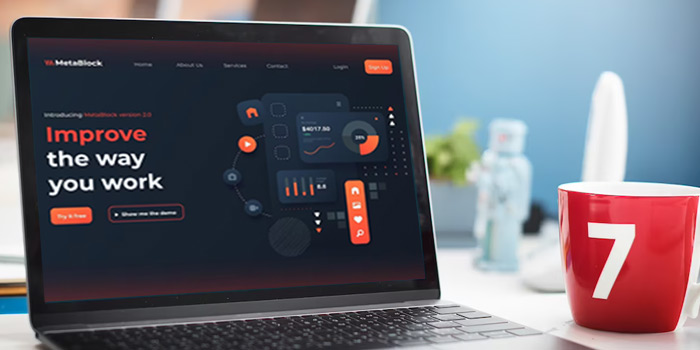 Your phone and computer are presumably in dark mode while you read this. You may incorporate this feature into your website as a web designer, though, didn’t you know? Low-lighting dark mode decreases eye strain, conserves battery life, and improves user accessibility. Of course, technical steps like updating the interface would be involved in creating this feature.
As it grows increasingly prevalent in the technologies we use, dark mode will continue to be a useful function. Also, allowing customers to convert to dark mode personalizes their interaction with your business.
-
Native SEO Design
You’ve probably seen that UX runs through all of these themes. To deliver an amazing Experience, web design largely relies on SEO’s ongoing evolution. Several aspects of SEO are changing, such as the emphasis on mobile-friendly websites, high-quality content, and user intent and focus. Together, they allow for the efficient transfer of information from your website and the reduction of website clutter to offer a more seamless UX.
-
Security of Data and Privacy
Going above and above the bare minimum is the goal of privacy and data security. GDPR will continue to exhort businesses to prioritize protecting user privacy in 2023. This entails limiting the use of cookies, disabling tracking, and only gathering the data that is essential. By developing opt-out pages and privacy policies in 2023, your business will get a competitive edge. Also, it enables customers to have a more cozy and reliable experience.
-
Micro-Interactions
Now, these may seem little and even minor, yet micro-interactions have a significant impact on how we use a site. What then is it? Simply put, a micro-interaction is a user and design interaction. If done well, they improve the user’s interaction with the design and increase its remembered qualities. It’s one of those things that you don’t realize you missed until it’s gone.
-
Convenient Navigation Bar
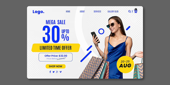
Over a dozen pages are typically present on the websites of B2B SaaS businesses. How do you decide which pages belong in the main navigation menu and attribute value to each of those pages? Let’s first talk about the characteristics of an intuitive navigation menu.
An easy-to-use menu will help your prospect go easily from page to page on the website, letting them read the information they want and ignore the ones they don’t. The total user experience you offer is all that matters.
Conclusion
The very last thing you want is for your website to appear antiquated or to perform poorly. By putting these B2B web design trends into practice, you’ll either be ahead of the curve or, at the very least, keep current with the market. It all comes down to prioritizing your users and providing excellent UX. Conversions will come after. Furthermore, if you are looking for corporate branding services, then get in touch with Creatix9.

